Beyond Dots on a Map: Visualising Real-World Networks with Graphileon and Neo4j
In today’s interconnected world, projects don’t exist in isolation. They are embedded in ecosystems of partnerships, thematic priorities, and overlapping objectives — each connection offering new insight and complexity. Yet when organisations try to visualise these real-world networks, especially on a map, they often hit a wall.
How do you represent relationships when multiple organisations share the same geolocation? How do you display overlapping projects without clutter or confusion? And how do you turn a map from a passive overview into an interactive lens that drives decision-making?
At Graphileon, we tackled this challenge head-on using our own low-code application development platform — built entirely on graph principles and powered by Neo4j. The result? A dynamic visualisation tool that goes far beyond dots on a map.
This blog post walks through:
- The challenge of mapping real-world project networks
- How graph thinking solves visual complexity
- A closer look at the underlying graph model and its interactions
- How Graphileon’s low-code graph platform makes this possible
The Challenge: Overlapping Projects, Shared Locations, and Complex Relationships
📍Imagine you’re managing a program with 200+ projects spread across regions. Each project involves multiple partners, aligns with multiple Sustainable Development Goals (SDGs), and belongs to a thematic cluster. You want a map-based interface that:
- Shows where the projects are located
- Allows users to explore how they’re connected
- Avoids overlap when projects or partners share the same spot
- Offers filtering, drilling down, and interaction
In a simple point-and-click GIS tool, this is nearly impossible. Pins stack on top of each other. Relationships aren’t visible. You get a dashboard, but not a network.
Here’s how we solved that — with a graph-first mindset.
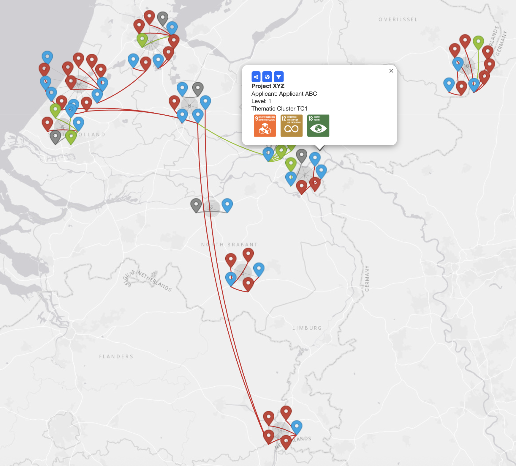
This map was created using LeafletMapView, enhanced with custom “spiderfier” logic to deal with overlapping markers. When two or more nodes share the same coordinates (e.g., projects hosted by the same organisation), they automatically fan out, revealing the connections between them in a clear and elegant way. Relationship arcs are drawn between nodes and styled according to the type of relationship — applicant, partner, thematic cluster, etc.
It’s more than a visualisation — it’s an interactive front-end for a living, queryable graph.
The Graph Behind the Map: Connections Made Explicit
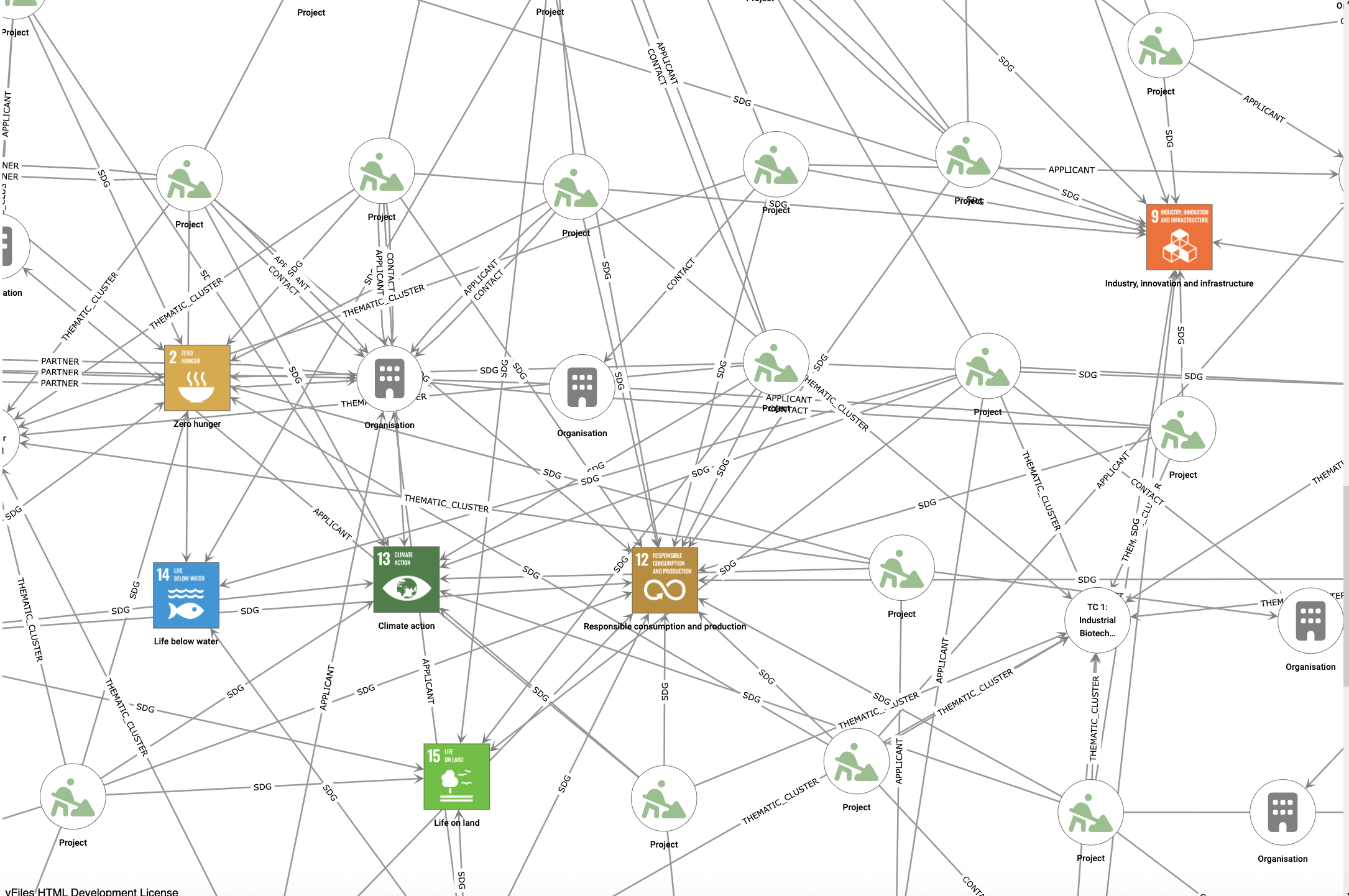
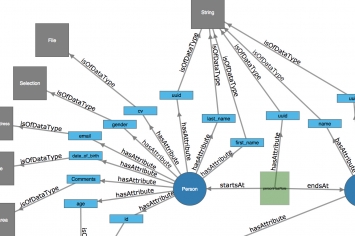
Under the hood, this interactive map is driven by a Neo4j property graph, which models the full ecosystem of relationships between entities. Projects, organisations, SDGs, and clusters are all represented as nodes, with relationships carrying rich metadata.
In this graph model, every connection tells a story:
(:Project)-[:APPLICANT]->(:Organisation)(:Project)-[:PARTNER]->(:Organisation)(:Project)-[:SDG]->(:SDG)(:Organisation)-[:THEMATIC_CLUSTER]->(:Cluster)
Instead of flattening these relationships into lists or tables, we preserve them as first-class citizens in the application.
From Graph to Application: Built with Graphileon
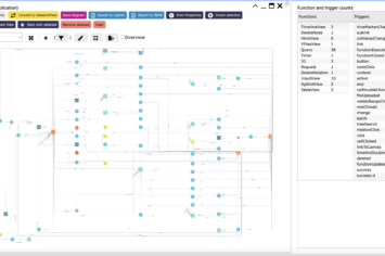
The application that powers this map — including the filters, legends, interaction handlers, and query triggers — is not hand-coded from scratch. It’s assembled using Graphileon, the only fully graph-based low-code platform.
In Graphileon, applications themselves are modeled as a graph. Every user interaction, UI component, and data request is represented using the pattern:
(:IA_Function)-[:TRIGGER]->(:IA_Function)This pattern describes how function nodes trigger each other in response to events. A filter selection may trigger a query; a map click may update a detail view; a successful query may refresh a legend.
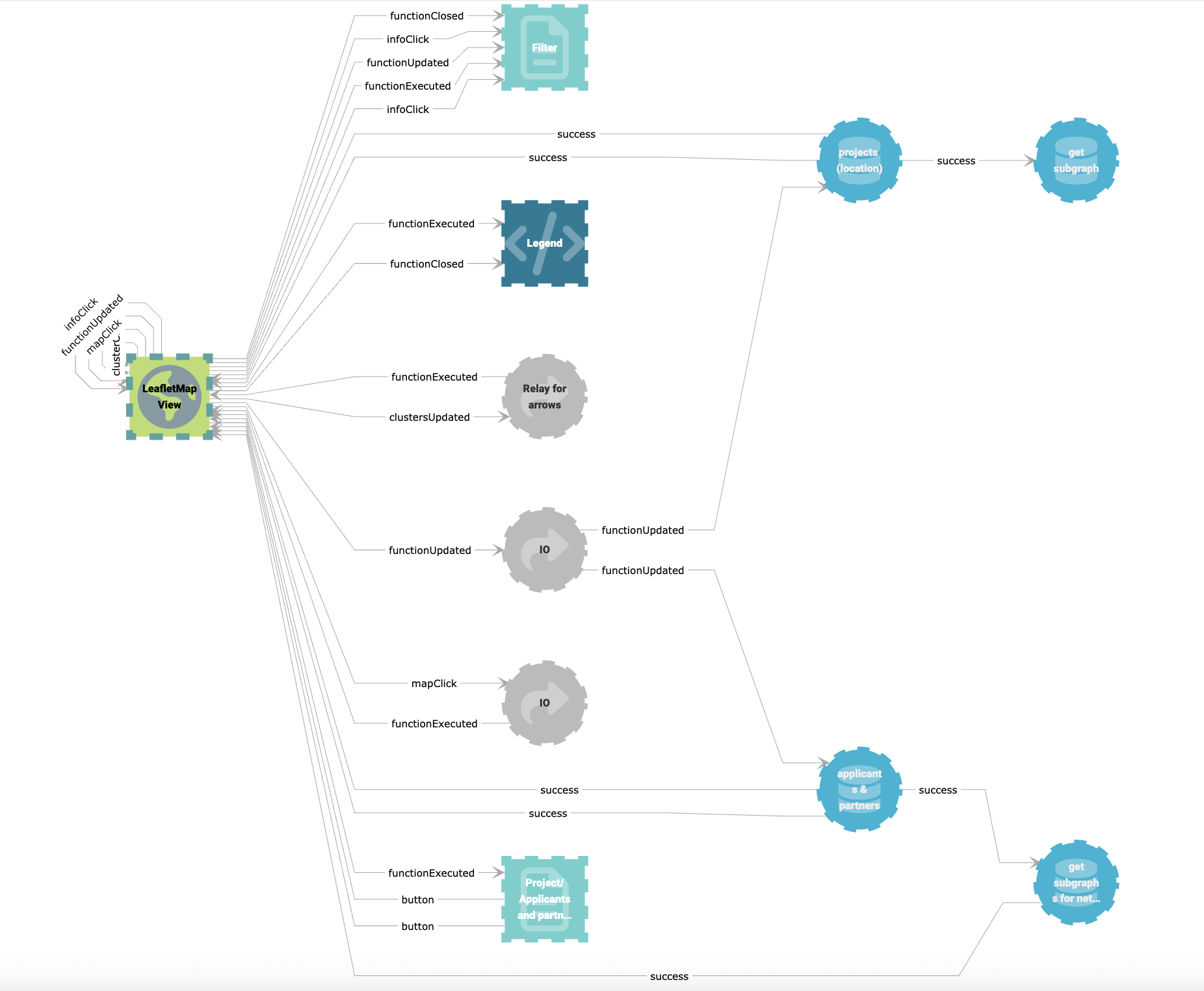
This model is incredibly flexible and transparent. You can see the logic of your application and modify it in real-time. Want to add a new SDG filter? Just add a function node and connect the right triggers.
Why This Matters
1. True Network Insight
With a graph backend and interactive visualisations, you can surface connections that were previously hidden:
- Projects that overlap in both theme and geography
- Organisations that play multiple roles
- SDGs that link clusters together
2. Seamless Design-Logic Integration
With Graphileon, everything — from the visual layout to the logic — lives in the graph itself.
3. Agility with Power
Low-code doesn’t mean low control. You still get:
- Dynamic queries and parameter inputs
- Integration with Leaflet, YFiles, JointJS, AgGrid and others
- Real-time data updates and visualisation refreshes
Beyond Maps: Endless Use Cases
Maps are just one interface. Imagine applying these techniques to:
- Stakeholder ecosystems
- Research grants and publications
- Supply chain visualisations
- Policy alignment with SDGs
Every one of these benefits from a visual interface powered by a graph data model underneath.
Summary
Here’s what makes this solution powerful:
- ✔️ LeafletMapView with spiderfier markers and stylised arcs
- ✔️ Neo4j backend modeling rich relationships
- ✔️ Graphileon’s low-code app layer based on triggers and functions
- ✔️ Transparent, modular logic in the application graph
- ✔️ Agile, extensible, and highly interactive
If you’re already using Graphileon, this is your sign to explore its full visual power. And if you’re new here — let’s build smarter applications, together.
 Cloud
Cloud